PET CITY HA CERRADO YA PERO YO NO CIERRO ESTE BLOG HASTA QUE COPIE LAS ENTRADAS QUE PUEDEN SERVIR PARA EL 2.
Lo que si he cerrado es la posibilidad de que dejeis comentarios aqui.
Si quereis preguntar algo, como será de Pet City 2, dejad los comentarios o preguntas en el otro.

miércoles, 14 de agosto de 2013

How to design a room with perspective

En español aquí

Would you like to do something like this?


Or like this?


All you have to do is follow these instructions and you will be able to do it.

I gave two examples because, although the technique is the same, the original wallpaper is the one you see in the walls in the first one, whereas in the second image the wallpaper is the one you see in the ceiling.
I will start with the first one.

1.- In an empty room, place a floor and a wallpaper. It is better to choose a floor that has identical extensions, just like this one has.


2.- Take an extension and place it in the layer 2, then we flip it.


The room’s depth will depend on how much we flip the extension. I flipped it 4 times in the image of the first example.


Once it is flipped, place it on the left of the room, trying to match the upper left angle of the extension with the floor. In order to place it on the left you must click outside of the extension and the yellow frame will disappear.

You will see this.


Then, pick a different coloured extension, beige for instance, and place it also in layer 2, flipping it 4 times opposite to the flips of the previous one, so you start to make the ceiling.


Place it as high up as possible, on the upper left angle of the game screen, and then add another extension to the floor and to the ceiling, to give the room more depth.


Notice that I have placed a metal bar in the place where the room’s corner will be. This bar acts as a guide to line both ceiling and floor properly.

If you want the room to be just one, with no adjacent rooms, repeat the steps on the opposite side, placing the extensions tilt in the same proportion both sides.


Follow the horizontal lines of ceiling and floor from the upper angle of both extensions. As you can see, I have used a vertical bar as a guide for the right-side corner.


However, if you want to create an adjacent room instead, like the one you see in the first example, you must do the perspective of that room just as you did on the left.

The only difference will be that you will be using shrank extensions, to make believe that the room is far.
Start with the ones that will fix the side wall.


I have set the room’s width with a second metal bar.
I have moved the extensions to leave space for the horizontals ones, because a part of the back wall must be seen.
(You can see here that I have replaced the bars with columns in order to make sure that the distance between floor and ceiling was correct.)


Add small extensions to the rest of the ceiling.


And then do the same for the floor.


A screen capture with the camera of the game shows how the whole design is going on.


You can make the right-side wall look straight, like the left-side one, by adjusting the extensions.


Use a column to mark the edges.


Use the camera of the game to see if there is anything wrong that could be hiding behind the buttons of the game.


You do not need to save and share. Just look for any detail that could slip your eyes, any extension that needs to be moved, etc.
Now you can place the windows.


As you can see, the tilt extensions are above the window because they were placed in layer 2, so all you have to do is to shrink the windows a little so that they cannot be seen over the floor or the ceiling, and so that the red wall is hidden.
You can use the metal bars, placed in layer 2 and flipped until you get the same angle than the window has, and then you framed its top and bottom…


You will see this:


I have only used two superimposed windows giving the impression of just one window with 3 glasses.
Then, put the windows to the cafeteria.
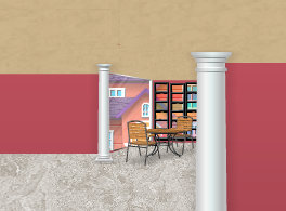

And some furniture.


I want it a big bigger, so I move the front column to the right.


Then I relocate the floor and ceiling extensions, and make some of them bigger…


Or I add some more, until I see this. I have used grey-coloured extensions for the coloured-glass wall, to make it different.


This is the final look of the room just before placing the furniture.


It can be used as a museum, like in the first example, or whatever you like.
The less tilt the extensions are, the less deep the room will be.


The second technique, the one in the second image with the white ceiling, is similar to the previous one. The only difference is that the white wallpaper will be the ceiling, and the extensions will act as walls.
Let’s start with the left-side wall, that will be straight…


…because there is only so far the tilt extensions can be placed, and it would look like this…


I change the colour of the wall for you to see the effect.


So, just as before, once the two first tilt extensions are placed and you have the baselines of the room, all you have to do is place more extensions to cover the area that will act as a wall, and then decorate it as you wish.


As for the light, the lamps that you see here are not availables in PC2, but you can find some ceiling lamp for sure :)

All right then! I think there is nothing left. If you have any doubt, you know what to do: comment on this post and I will try to help you.

domingo, 11 de agosto de 2013

Como hacer una sala con perspectiva.

English version here.


¿Quieres hacer algo parecido a ésto?


¿O a ésto?


Pues sigue atentamente las explicaciones que voy a dar y tu también serás capaz de hacerlo.

He puesto dos ejemplos porqué, aunque la técnica es la misma, en la de arriba el wallpaper original es la pared mientras que en la de abajo el wallpaper es el que se ve en el techo.

Empezaré por la de arriba.

1.- En una sala vacía, colocamos un suelo y un wallpaper.
Es preferible usar un suelo que disponga de extensiones exactamente iguales, como éste.


2.- Cogemos una extensión, la ponemos en layer 2 y la giramos.


De lo mucho o poco que la giremos dependerá la profundidad de la sala.
Para hacer la sala que se ve arriba de todo lo giré 4 clicks.


una vez girado lo colocamos a la izquierda del todo procurando que coincida el ángulo superior izquierdo de la pieza, con el suelo.
Para que quede totalmente a la izquierda se ha de pinchar fuera de la pieza para que desaparezca el recuadro amarillo.
Se verá así.


Luego con un extensor de un color distinto, por ejemplo este beige, tampién en layer 2 y girándolo 4 clicks en sentido contrario, empezaremos a crear el techo así.


Lo colocaremos lo más arriba que podamos, en el ángulo superior izquierdo de la pantalla del juego y añadiremos una pieza inclinada más a suelo y techo, para que la sala tenga mayor profundidad.


Fíjate que he colocado un palo de metal en el lugar donde va a estar la esquina de la sala. Esto es una guia para que techo y suelo queden bien alineados.

Si queremos que la sala sea solo una, sin salas adyacentes, haremos lo mismo en el lado contrario, colocando piezas inclinadas en la misma proporción a ambos lados.


Continuamos la línea horizontal de techo y suelo a partir del ángulo superior de ambas piezas.
Como ves he usado el palo vertical para marcar la esquina del lado derecho.


Pero si en lugar de esto queremos hacer una sala adyacente, como la que se ve en la imagen de arriba de todo, crearemos la perspectiva de dicha sala, como hemos hecho a la izquierda.
La única diferencia es que trabajaremos con piezas muy encogidas, ya que la sala está muy lejos.
Empezaremos por las que van a marcar la pared lateral.


Con el segundo palo metálico he marcado la anchura de la sala.
Como se ha de ver una parte de la pared del fondo, muevo las piezas para dejar espacio a las horuizontales.
(Aquí habia sustituido los palos por columnas a fin de asegurarme de que la distancia entre suelo y techo era la correcta.)


Añado piezas hechas muy pequeñas para el resto del techo


y luego hago lo mismo en el suelo


Una foto con la máquina del juego me muestra como está quedando el conjunto


Podemos hacer que la pared de la derecha también se vea recta, como la de la izquierda, retocando los segmentos necesarios para ello.


Y con una columna lo delimitamos.


Uso la máquina del juego para ver si hay algún fallo que haya quedado detrás de los distintos iconos y botones del juego


No hace falta guardar ni compartir. Tan solo ver si hay algo que escape a la vista, alguna pieza que necesite moverse un poco, etc.

Llegado a este punto, le pongo las ventanas


Como podeis ver, los segmentos inclinados, al estar en layer 2, quedan por encima de la ventana, de manera que solo es cuestión de encogerlas hasta el punto adecuado para que no asomen por el suelo ni por el techo, ni quede a la vista la pared roja.

Podemos usar los palos metálicos, poniéndolos en layer 2 y girándolos has conseguir el mismo ángulo que la ventana, para enmarcarla por arriba y por abajo...


y que se vea así:


He usado solo dos ventanas superpuestas, que han dado la sensación de ser una sola con 3 cristales.

Ahora le coloco ventanas a la zona que será la cafetería.


y unos muebles.


Pienso que podría hacerla un poco más grande, así que muevo la columna de delante hacia la derecha


recoloco los segmentos del suelo y del techo, haciendo más grandes algunos...


o añadiendo otros, hasta que queda así. De paso he usado extensores de color gris para esa pared de cirstales de colores, y diferenciarla de las otras.


y este es el aspecto final de la sala antes de amueblarla.


podemos usarla como museo, como en el ejemplo de arriba, o como lo que queramos.

Menos inclinación en los segmentos nos dará una sala con una sensación menor de profundidad.


El segundo sistema, en el que se ve el techo blanco, es muy parecido a éste. La única diferencia es que el wallpaper blanco lo dejaremos como techo y pondremos segmentos en las paredes.

Empezamos por crear la pared de la izquierda, que será recta...


ya que los segmentos inclinados no se pueden colocar más allá de un cierto punto y se verían así...


para que veais el efecto, pongo una pared de otro color.


Así que, al igual que antes, una vez colocadas las dos primeras piezas inclinadas que nos dan la base del montaje, solo es cuestión de ir poniendo piezas para cubrir toda la zona que será pared y finalmente decorar la sala a nuestro gusto.


En cuanto a la iluminación, las lámparas que ves aquí ya no existen, pues eran de la versión anterior del juego, pero seguro que hay algunas en PC2 que sirvan para ello.

¡Bueno! Creo que no he olvidado explicar nada, pero si tienes alguna duda, ya sabes, comentario y trataré de resolverla.

martes, 9 de julio de 2013

Decoración- Advanced Mode

Me da la impresión de que después de varias entradas en las que os he hablado de los layers y de otros temas, no he explicado a fondo como y donde, así que voy a explicarlo.

Cuando vamos a decorar una sala y abrimos el baul para sacar las cosas que vamos a poner en ella, a la derecha vemos ésto:


Pinchando en este botón que dice Advanced mode, aparece esta barra de herramientas.


Pinchando en cualquier item se activan los botones. Por ejemplo este patinete.


También aparece el nombre del artículo que hay pinchado.

Podemos mover esta barra y colocarla donde nos vaya mejor para trabajar...


...aunque yo suelo centrarla encima de las pestañas del baul. Pero contra gustos...

Sigamos.
Vemos que el patinete está colocado en Default Layer, esa es la capa en la que están todos los items cuando los compramos.

Pinchando en esta flechita que hay junto a Default Layer...


...podemos cambiarlo para ponerlo en algún sitio donde normalmente no se podría.


También se activan los botones para girar, que antes estaban desactivados.

En el sentido de las agujas del reloj...


y en sentido contrario


En cualquiera de los layers podemos girar los items de lado con estas flechas blancas en fondo azul


Y hacerlas más pequeñas...


...o más grandes, si las hemos achicado.


Pero no podemos hacerlo más grande del tamaño original.

Tenemos hasta 20 layers para trabajar, lo que nos permite poner las cosas bien en cualquier tipo de decoración que queramos hacer.


Recuerda: He explicado como usarlos en varias entradas. Puedes verlas pinchando aquí.

Related Posts Plugin for WordPress, Blogger...